
1.安装方式
npm install echarts --save
2.引入 ECharts
import * as echarts from 'echarts';
// 基于准备好的dom,初始化echarts实例
var myChart = echarts.init(document.getElementById('main'));
// 绘制图表
myChart.setOption({
  title: {
    text: 'ECharts 入门示例'
  },
  tooltip: {},
  xAxis: {
    data: ['衬衫', '羊毛衫', '雪纺衫', '裤子', '高跟鞋', '袜子']
  },
  yAxis: {},
  series: [
    {
      name: '销量',
      type: 'bar',
      data: [5, 20, 36, 10, 10, 20]
    }
  ]
});
3.图表容器及大小
1.在 HTML 中定义有宽度和高度的父容器(推荐)
通常来说,需要在 HTML 中先定义一个 <div> 节点,并且通过 CSS 使得该节点具有宽度和高度。初始化的时候,传入该节点,图表的大小默认即为该节点的大小,除非声明了 opts.width 或 opts.height 将其覆盖。需要注意的是,使用这种方法在调用 echarts.init 时需保证容器已经有宽度和高度了。
<div id="main" style="width: 600px;height:400px;"></div>
<script type="text/javascript">
  var myChart = echarts.init(document.getElementById('main'));
</script>
2.指定图表的大小
如果图表容器不存在宽度和高度,或者,你希望图表宽度和高度不等于容器大小,也可以在初始化的时候指定大小。
<div id="main"></div>
<script type="text/javascript">
  var myChart = echarts.init(document.getElementById('main'), null, {
    width: 600,
    height: 400
  });
</script>
3.响应容器大小的变化
监听图标容器的大小并改变图表大小
<script type="text/javascript">
  var myChart = echarts.init(document.getElementById('main'));
  window.onresize = function() {
    myChart.resize();
  };
</script>
4.为图表设置特定的大小
除了直接调用 resize() 不含参数的形式之外,还可以指定宽度和高度,实现图表大小不等于容器大小的效果。
myChart.resize({
  width: 800,
  height: 400
});
4.容器节点被销毁以及被重建时
假设页面中存在多个标签页,每个标签页都包含一些图表。当选中一个标签页的时候,其他标签页的内容在 DOM 中被移除了。这样,当用户再选中这些标签页的时候,就会发现图表“不见”了。
本质上,这是由于图表的容器节点被移除导致的。即使之后该节点被重新添加,图表所在的节点也已经不存在了。
正确的做法是,在图表容器被销毁之后,调用 echartsInstance.dispose 销毁实例,在图表容器重新被添加后再次调用 echarts.init 初始化。
完整基础用法:
    async mounted() {
      window.addEventListener('resize', () => {
        this.myChart.resize()
      })
    },
     //收支情况柱状图
      drawTotalChart() {
        if (
          this.myChart != null &&
          this.myChart != '' &&
          this.myChart != undefined
        ) {
          this.myChart.dispose()
        }
        let chartDom = document.getElementById('totalmain')
        this.myChart = echarts.init(chartDom)

        let option = {
          color: ['rgba(96, 154, 240, 1)', 'rgba(107, 204, 212, 1)'],
          tooltip: {
            trigger: 'axis',
            axisPointer: {
              type: 'shadow',
            },
          },
          grid: {
            top: 50,
            left: 0,
            right: 0,
            bottom: 20,
            containLabel: true,
          },
          legend: {
            data: ['收入', '支出'],
            x: 'left',
            padding: [0, 0, 0, 0],
            itemStyle: {},
          },
          xAxis: {
            type: 'category',
            data: this.monthList,
          },
          yAxis: {},
          series: [
            { data: this.totalincome, type: 'bar', name: '收入' },
            { data: this.totalspend, type: 'bar', name: '支出' },
          ],
        }
        option && this.myChart.setOption(option)
      },
5.ECharts 中的样式
1.颜色主题
- ECharts 中默认内置了两套主题: light dark。可以像这样切换成深色模式:
var chart = echarts.init(dom, 'dark');
其他的主题,没有内置在 ECharts 中,需要自己加载
在echarts资源/主题构建工具中下载需要的主题并引入,在echarts初始化时,使用主题。可以使用多个不同的主题。例如:
let myChart = echarts.init(document.getElementById("School"),'macarons');
- 注意:使用时不能自己指定color,否则主题的颜色将失效,变为指定的颜色
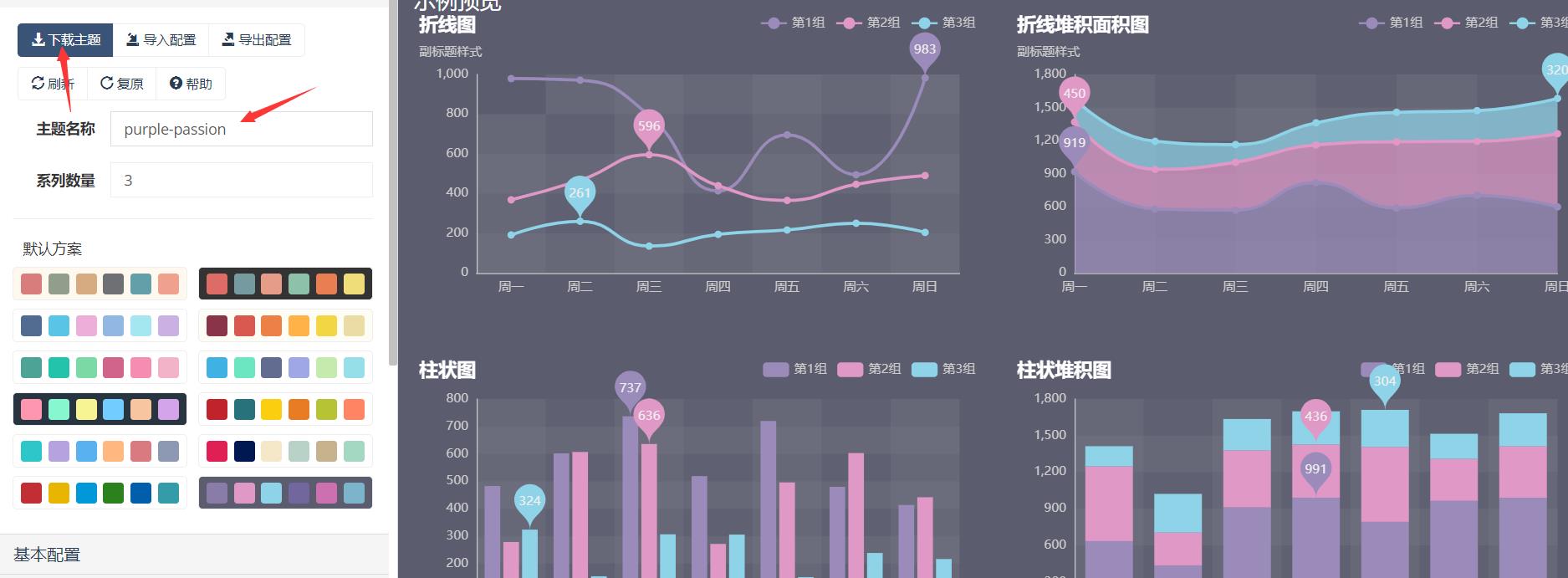
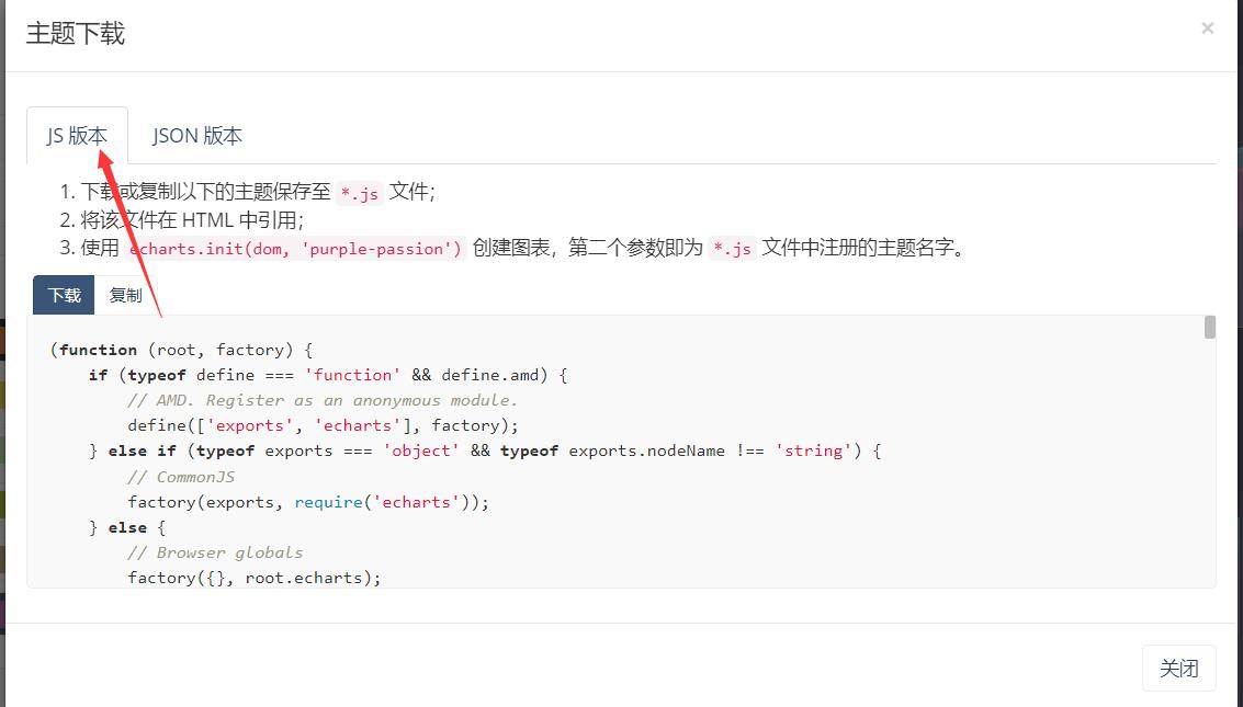
  import '@/utils/purple-passion'
  import '@/utils/infographic'

  let chartDom = document.getElementById('paymentMain')
  this.paymentMyChart = echarts.init(chartDom, 'infographic')

  let chartDom = document.getElementById('totalmain')
  this.myChart = echarts.init(chartDom, 'purple-passion')
2.调色盘
调色盘,可以在 option 中设置。它给定了一组颜色,图形、系列会自动从其中选择颜色。 可以设置全局的调色盘,也可以设置系列自己专属的调色盘。
option = {
  // 全局调色盘。
  color: [
    '#c23531',
    '#2f4554',
    '#61a0a8',
    '#d48265',
    '#91c7ae',
    '#749f83',
    '#ca8622',
    '#bda29a',
    '#6e7074',
    '#546570',
    '#c4ccd3'
  ],

  series: [
    {
      type: 'bar',
      // 此系列自己的调色盘。
      color: [
        '#dd6b66',
        '#759aa0',
        '#e69d87',
        '#8dc1a9',
        '#ea7e53',
        '#eedd78',
        '#73a373',
        '#73b9bc',
        '#7289ab',
        '#91ca8c',
        '#f49f42'
      ]
      // ...
    },
    {
      type: 'pie',
      // 此系列自己的调色盘。
      color: [
        '#37A2DA',
        '#32C5E9',
        '#67E0E3',
        '#9FE6B8',
        '#FFDB5C',
        '#ff9f7f',
        '#fb7293',
        '#E062AE',
        '#E690D1',
        '#e7bcf3',
        '#9d96f5',
        '#8378EA',
        '#96BFFF'
      ]
      // ...
    }
  ]
};
3.高亮的样式:emphasis
在鼠标悬浮到图形元素上时,一般会出现高亮的样式。默认情况下,高亮的样式是根据普通样式自动生成的。但是高亮的样式也可以自己定义,主要是通过 emphasis 属性来定制。emphsis 中的结构,和普通样式的结构相同,例如:
         series: [
            {
              name: '报销',
              type: 'pie',
              radius: '90%',
              hoverAnimation: false,
              emphasis: {
                itemStyle: {
                  // 高亮时点的颜色。
                  color: 'skyblue',
                },
                label: {
                  show: true,
                  // 高亮时标签的文字。
                  formatter: 'This is a emphasis label.',
                },
              },
              label: {
                normal: {
                  show: true,
                  formatter: '{d}%',
                  position: 'inner',
                  textStyle: {
                    align: 'center',
                    baseline: 'middle',
                    fontFamily: '微软雅黑',
                    fontSize: 14,
                    color: 'white',
                  },
                },
                labelLine: {
                  show: false,
                },
              },
              data: this.data.reservationReimburseItemList,
            },
          ],
4.直接的样式设置
直接的样式设置是比较常用设置方式。纵观 ECharts 的 option 中,很多地方可以设置 itemStyle、lineStyle、areaStyle、label 等等。这些的地方可以直接设置图形元素的颜色、线宽、点的大小、标签的文字、标签的样式等等。上面的示例中已举例
6.坐标轴
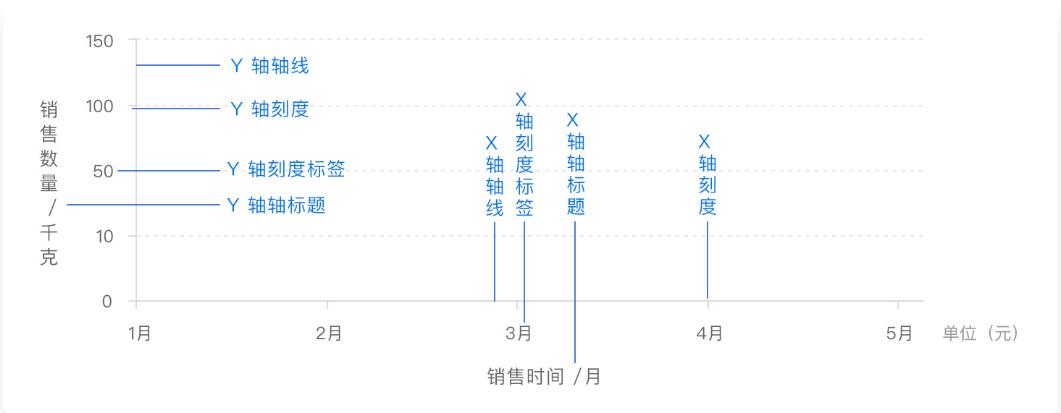
1.x 轴、y 轴
x 轴和 y 轴都由轴线、刻度、刻度标签、轴标题四个部分组成。部分图表中还会有网格线来帮助查看和计算数据
普通的二维数据坐标系都有 x 轴和 y 轴,通常情况下,x 轴显示在图表的底部,y 轴显示在左侧,一般配置如下:
option = {
  xAxis: {
    // ...
  },
  yAxis: {
    // ...
  }
};
在二维数据中,轴也可以有多个。ECharts 中一般情况下单个 grid 组件最多只能放两个 x/y 轴,多于两个 x/y 轴需要通过配置 offset 属性防止同个位置多个轴的重叠。两个 x 轴显示在上下,两个 y 轴显示在左右两侧。
option = {
  xAxis: {
    type: 'time',
    name: '销售时间'
    // ...
  },
  yAxis: [
    {
      type: 'value',
      name: '销售数量'
      // ...
    },
    {
      type: 'value',
      name: '销售金额'
      // ...
    }
  ]
  // ...
};
轴线:ECharts 提供了轴线 axisLine 相关的配置,我们可以根据实际情况调整,例如轴线两端的箭头,轴线的样式等。
option = {
  xAxis: {
    axisLine: {
      symbol: 'arrow',
      lineStyle: {
        type: 'dashed'
        // ...
      }
    }
    // ...
  },
  yAxis: {
    axisLine: {
      symbol: 'arrow',
      lineStyle: {
        type: 'dashed'
        // ...
      }
    }
  }
  // ...
};
刻度:ECharts 提供了轴线 axisTick 相关的配置,我们可以根据实际情况调整,例如刻度线的长度,样式等。
option = {
  xAxis: {
    axisTick: {
      length: 6,
      lineStyle: {
        type: 'dashed'
        // ...
      }
    }
    // ...
  },
  yAxis: {
    axisTick: {
      length: 6,
      lineStyle: {
        type: 'dashed'
        // ...
      }
    }
  }
  // ...
};
刻度标签:ECharts 提供了轴线 axisLabel 相关的配置,我们可以根据实际情况调整,例如文字对齐方式,自定义刻度标签内容等。
option = {
  xAxis: {
    axisLabel: {
      formatter: '{value} kg',
      align: 'center'
      // ...
    }
    // ...
  },
  yAxis: {
    axisLabel: {
      formatter: '{value} 元',
      align: 'center'
      // ...
    }
  }
  // ...
};
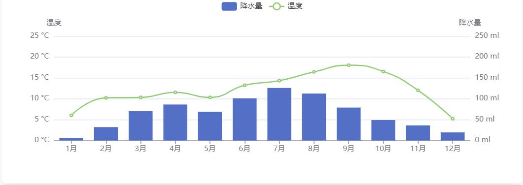
示例:图左侧的 y 轴代表东京月平均气温,右侧的 y 轴表示东京降水量,x 轴表示时间。两组 y 轴在一起,反映了平均气温和降水量间的趋势关系。
option = {
  tooltip: {
    trigger: 'axis',
    axisPointer: { type: 'cross' }
  },
  legend: {},
  xAxis: [
    {
      type: 'category',
      axisTick: {
        alignWithLabel: true
      },
      data: [
        '1月',
        '2月',
        '3月',
        '4月',
        '5月',
        '6月',
        '7月',
        '8月',
        '9月',
        '10月',
        '11月',
        '12月'
      ]
    }
  ],
  yAxis: [
    {
      type: 'value',
      name: '降水量',
      min: 0,
      max: 250,
      position: 'right',
      axisLabel: {
        formatter: '{value} ml'
      }
    },
    {
      type: 'value',
      name: '温度',
      min: 0,
      max: 25,
      position: 'left',
      axisLabel: {
        formatter: '{value} °C'
      }
    }
  ],
  series: [
    {
      name: '降水量',
      type: 'bar',
      yAxisIndex: 0,
      data: [6, 32, 70, 86, 68.7, 100.7, 125.6, 112.2, 78.7, 48.8, 36.0, 19.3]
    },
    {
      name: '温度',
      type: 'line',
      smooth: true,
      yAxisIndex: 1,
      data: [
        6.0,
        10.2,
        10.3,
        11.5,
        10.3,
        13.2,
        14.3,
        16.4,
        18.0,
        16.5,
        12.0,
        5.2
      ]
    }
  ]
};
7.事件与行为
在 Apache ECharts 的图表中用户的操作将会触发相应的事件。开发者可以监听这些事件,然后通过回调函数做相应的处理。在 ECharts 中事件分为两种类型,一种是用户鼠标操作点击,或者 hover 图表的图形时触发的事件,还有一种是用户在使用可以交互的组件后触发的行为事件,例如在切换图例开关时触发的 ‘legendselectchanged’ 事件(这里需要注意切换图例开关是不会触发 'legendselected' 事件的),数据区域缩放时触发的 ‘datazoom’ 事件等等。
1.鼠标事件的处理
ECharts 支持常规的鼠标事件类型,包括 'click'、 'dblclick'、 'mousedown'、 'mousemove'、 'mouseup'、 'mouseover'、 'mouseout'、 'globalout'、 'contextmenu' 事件。
myChart.on('click', function(params) {
  window.open('https://www.baidu.com/s?wd=' + encodeURIComponent(params.name));
});
所有的鼠标事件包含参数 params,这是一个包含点击图形的数据信息的对象,如下格式:
type EventParams = {
  // 当前点击的图形元素所属的组件名称,
  // 其值如 'series'、'markLine'、'markPoint'、'timeLine' 等。
  componentType: string;
  // 系列类型。值可能为:'line'、'bar'、'pie' 等。当 componentType 为 'series' 时有意义。
  seriesType: string;
  // 系列在传入的 option.series 中的 index。当 componentType 为 'series' 时有意义。
  seriesIndex: number;
  // 系列名称。当 componentType 为 'series' 时有意义。
  seriesName: string;
  // 数据名,类目名
  name: string;
  // 数据在传入的 data 数组中的 index
  dataIndex: number;
  // 传入的原始数据项
  data: Object;
  // sankey、graph 等图表同时含有 nodeData 和 edgeData 两种 data,
  // dataType 的值会是 'node' 或者 'edge',表示当前点击在 node 还是 edge 上。
  // 其他大部分图表中只有一种 data,dataType 无意义。
  dataType: string;
  // 传入的数据值
  value: number | Array;
  // 数据图形的颜色。当 componentType 为 'series' 时有意义。
  color: string;
};